Global Carbon Emission Analysis
Published:
Global warming has been brought up a long time ago, but it never draws most people’s attention not even me till recently. Since 2020, the wild fires in Australia and north America terrified me a lot. In 2022, heat wave storms most places all around the world. Human activities could be one of the main reasons for those catastrophic climate problems. Carbon emission is considered a good proxy to quantify the influence of human activities to global warming. This article tries to give some insights about the current status and historical change of global carbon emission.
Data Sourse
The data for this analysis is from World Bank Open Data, link: https://data.worldbank.org/
To download the CSV.file, you will get:
- each country’s carbon emission data
- country metadata
- indicator metadata
Data exploration
Import each country’s carbon emission data.
d <- read.csv("API_EN.ATM.CO2E.KT_DS2_en_csv_v2_4354173.csv", skip = 3)
Carbon emission data is collected since 1990, the year before that shows NA, we need to remove the year without data and remove variables we do not need.
library(tidyverse)
## Warning: package 'readr' was built under R version 4.2.2
Build a function to choose columns which are not all data are NA. Then select those columns to a new dataset.
not_all_na <- function(x) any(!is.na(x))
d_comp <- select(d, where(not_all_na),
                            -"Indicator.Name", -"Indicator.Code")
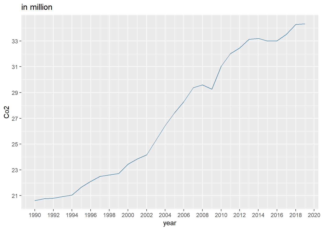
Co2 emission for the whole world.{.tabset}
The world total carbon emission is contained in the data, with country name World.
Pick out the data for World, convert it into panel data.
world <- d_comp[d_comp$Country.Name == "World", ]
world_p <- pivot_longer(world, names_to = "year", values_to = "co2",
                               cols = starts_with("X"))
Remove the X in front of each year, and declare it is number.
world_p$year <- as.numeric(substr(world_p$year, 2, 5))
Use ggplot2.
library(ggplot2)
p1 <- ggplot(data = world_p, aes(x = year, y = co2/1000000))
p1 + geom_line(color = "steelblue") +
  scale_x_continuous(breaks = seq(1988, 2021, 2)) +
  scale_y_continuous(breaks = seq(17, 34, 2)) + ylab("Co2") +
  ggtitle("in million")
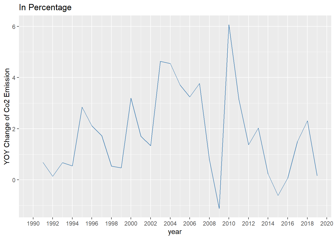
YOY Change in percentage.
Calculate the year over year change of carbon emission.
world_p$change <- (world_p$co2-dplyr::lag(world_p$co2))/dplyr::lag(world_p$co2)*100
p1.1 <- ggplot(data = world_p, aes(x=year, y=change))
p1.1 + geom_line(color="steelblue") +
  scale_x_continuous(breaks=seq(1988,2021,2))+
ylab("YOY Change of Co2 Emission") +
  ggtitle("In Percentage")
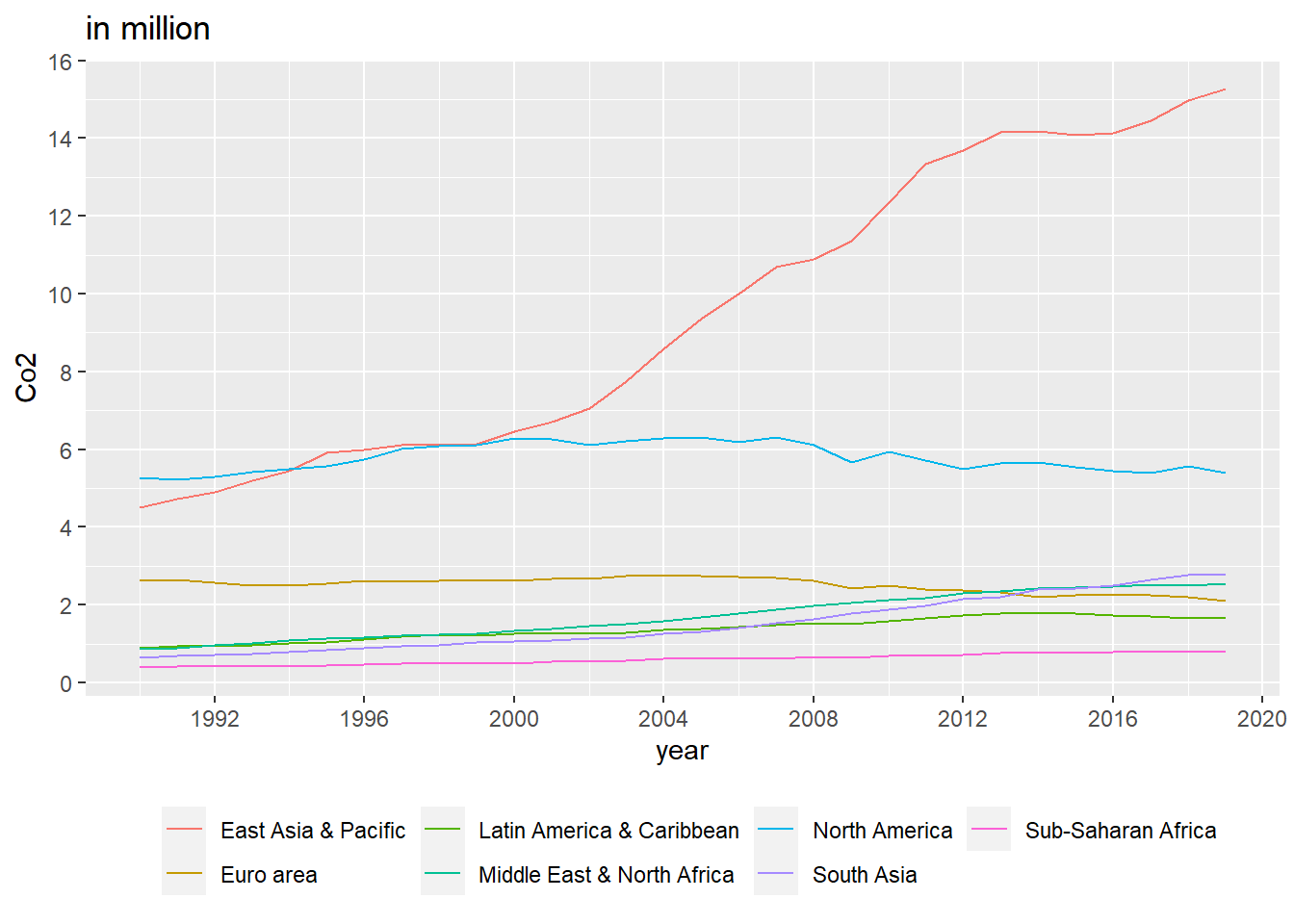
Co2 emission in different area{.tabset}
Except for the world total carbon emission, different geographic area’s carbon emission is also collected in the data.
Get total carbon emission for each row through all time
d_comp$co2_total <- rowSums(d_comp[ ,3:32])
d_comp <- arrange(d_comp, desc(co2_total))
Pick geographic area.
co2_area <- d_comp[d_comp$Country.Name %in% c("East Asia & Pacific", "North America", "Euro area", "Middle East & North Africa", "South Asia", "Latin America & Caribbean", "Sub-Saharan Africa"), ]
Convert dataset to panel data.
co2_area_p <- pivot_longer(co2_area, names_to="year", values_to = "co2", cols = starts_with("X"))
co2_area_p$year <- as.numeric(substr(co2_area_p$year, 2, 5))
co2_area_p <- arrange(co2_area_p, desc(co2_total))
Line Plot.{-}
p2 <- ggplot(data = co2_area_p, aes(x=year, y=co2/1000000, color=Country.Name))
p2 + geom_line() +
  scale_x_continuous(breaks=seq(1988,2021,4))+
  scale_y_continuous(breaks=seq(0, 16, 2)) + ylab("Co2") +
  ggtitle("in million") +
  theme(legend.position="bottom", legend.title = element_blank())
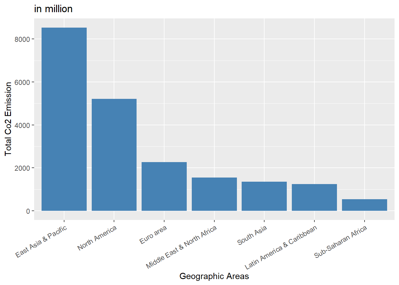
Bar Plot.{-}
p3 <- ggplot(data = co2_area_p, aes(x=reorder(Country.Name, -co2_total), y=co2_total/1000000))
p3 + geom_bar(stat="identity", fill="steelblue") +
  ggtitle("in million") +  ylab("Total Co2 Emission") + xlab("Geographic Areas") +
  theme(axis.text.x = element_text(angle = 30, hjust = 1))
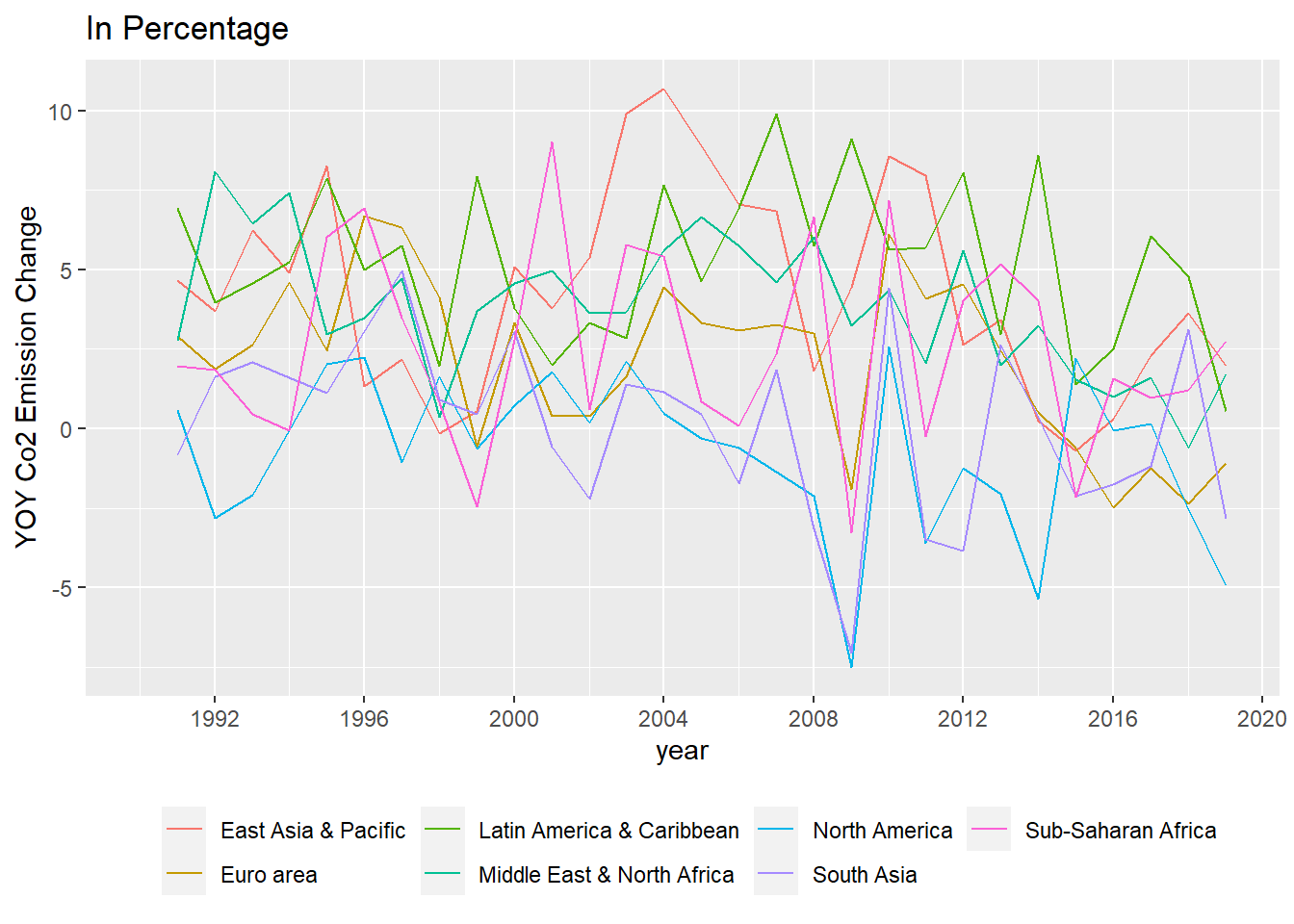
YOY Change{-}
Group the data co2_area_p by country name, in each group calculate the year over year carbon emission change in percentage.
co2_area_p %>%
  group_by(Country.Name) %>%
  summarise((co2-dplyr::lag(co2))/dplyr::lag(co2)*100) -> co2_area_p$change
By using “group_by” and “summarise”, R will generate a dataset under variable “change”, we need to handle it.
co2_area_p$change <- co2_area_p$change$`(co2 - dplyr::lag(co2))/dplyr::lag(co2) * 100`
Plot the data
p2.1 <- ggplot(data = co2_area_p, aes(x=year, y=change, color=Country.Name))
p2.1 + geom_line() +
  scale_x_continuous(breaks=seq(1988,2021,4))+
ylab("YOY Co2 Emission Change") +
  ggtitle("In Percentage") +
  theme(legend.position="bottom", legend.title = element_blank())
Co2 emission for top 10 countries{.tabset}
Get carbon emission for top 10 countries through all time.
country_data <- d_comp[c(15, 17, 30, 32, 36, 43:266), ]
country_10 <- country_data[c(1:8, 10:11), ]
Convert it to panel data
country_10_pan <- pivot_longer(country_10, names_to="year", values_to = "co2", cols = starts_with("X"))
country_10_pan$year <- as.numeric(substr(country_10_pan$year, 2, 5))
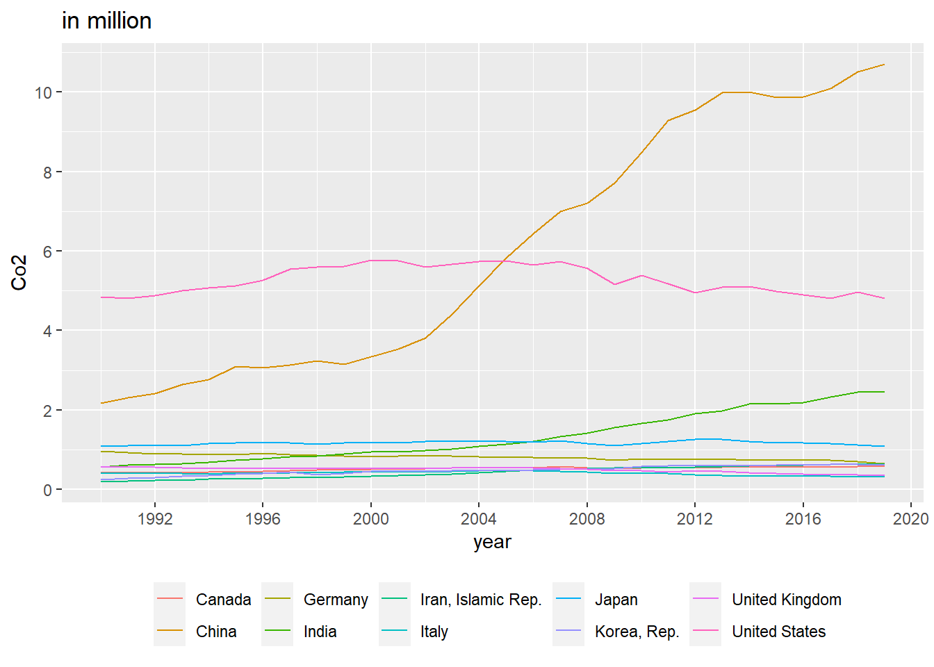
Line Plot for top 10 countries.{-}
p4 <- ggplot(data = country_10_pan, aes(x=year, y=co2/1000000, color=Country.Name))
p4 + geom_line() +
  scale_x_continuous(breaks=seq(1988,2021,4))+
  scale_y_continuous(breaks=seq(0, 16, 2)) + ylab("Co2") +
  ggtitle("in million") +
  theme(legend.position="bottom", legend.title = element_blank())
Bar Plot for top 10 countries.{-}
p5 <- ggplot(data = country_10_pan, aes(x=reorder(Country.Name, -co2_total), y=co2_total/1000000))
p5 + geom_bar(stat="identity", fill="steelblue") +
  ggtitle("in million") +  ylab("Total Co2 Emission") + xlab("Country") +
  theme(axis.text.x = element_text(angle = 30, hjust = 1))
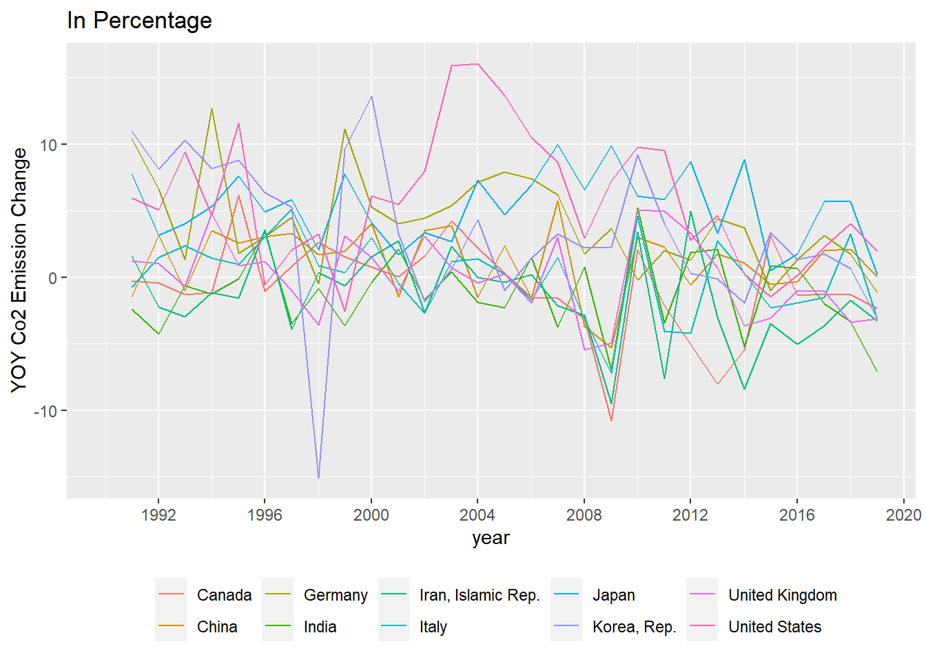
YoY Change for top 10 countries.{-}
country_10_pan %>%
  group_by(Country.Name) %>%
  summarise((co2-dplyr::lag(co2))/dplyr::lag(co2)*100) -> country_10_pan$change
country_10_pan$change <- country_10_pan$change$`(co2 - dplyr::lag(co2))/dplyr::lag(co2) * 100`
Plot the data
p2.1 <- ggplot(data = country_10_pan, aes(x=year, y=change, color=Country.Name))
p2.1 + geom_line() +
  scale_x_continuous(breaks=seq(1988,2021,4))+
ylab("YOY Co2 Emission Change") +
  ggtitle("In Percentage") +
  theme(legend.position="bottom", legend.title = element_blank())
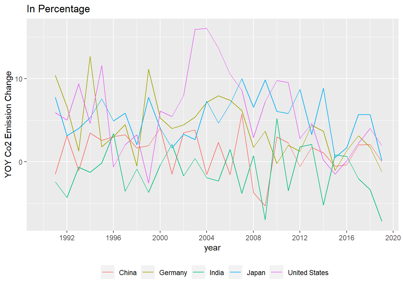
YoY Change for top 5 countries.{-}
p2.2 <- ggplot(data = country_10_pan[1:150, ], aes(x=year, y=change, color=Country.Name))
p2.2 + geom_line() +
  scale_x_continuous(breaks=seq(1988,2021,4))+
ylab("YOY Co2 Emission Change") +
  ggtitle("In Percentage") +
  theme(legend.position="bottom", legend.title = element_blank())